#5
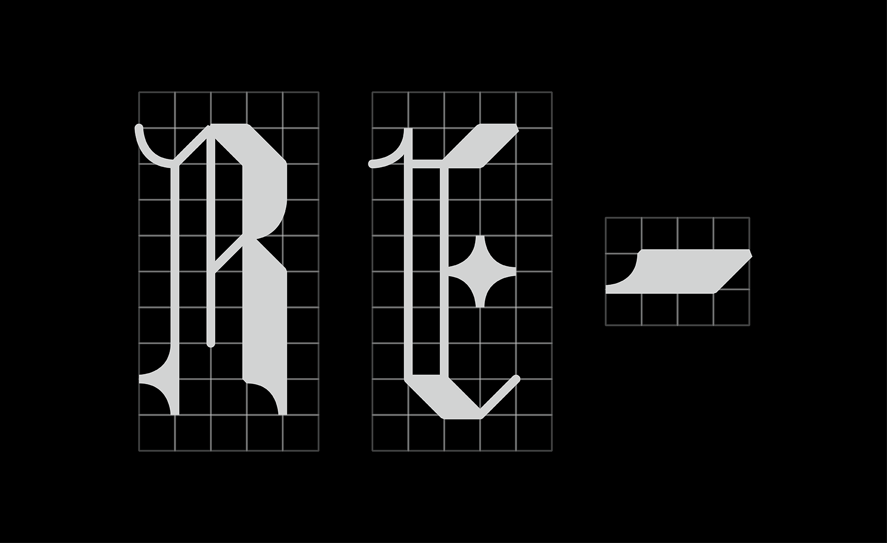
/At last we finally get to the design of the logo we officially went with. A group member was kind enough to design an entire font family for our agency inspired by traditionally historic blackletter with a touch of modernization. This is the agency name in those letters. Our team member chose light grey instead of white and opted for our visual identity to use black as a backdrop as often as possible when displaying our typeface. The barely visible grid behind the letters adds for a special touch.


