Week 10 - #3

It came time to print my final handmade art element of my exhibit. I decided to use the risograph printer to print my fairy landscape digital sketch. I photoshopped my sketch to extend to the dimensions of an A3 piece of paper and brought a couple digital versions to the studio. At this point I had used the risograph for three previous projects, so I felt comfortable doing it again. I printed the four black versions I had photoshopped and after deciding which composition I liked best I decided to explore printing them in color. This proved much harder than printing with black as most prints didn’t come out at all. The digital sketch was so fine it barely registered on the master stamps. In the end I will be displaying the black option.

Week 10 - #2

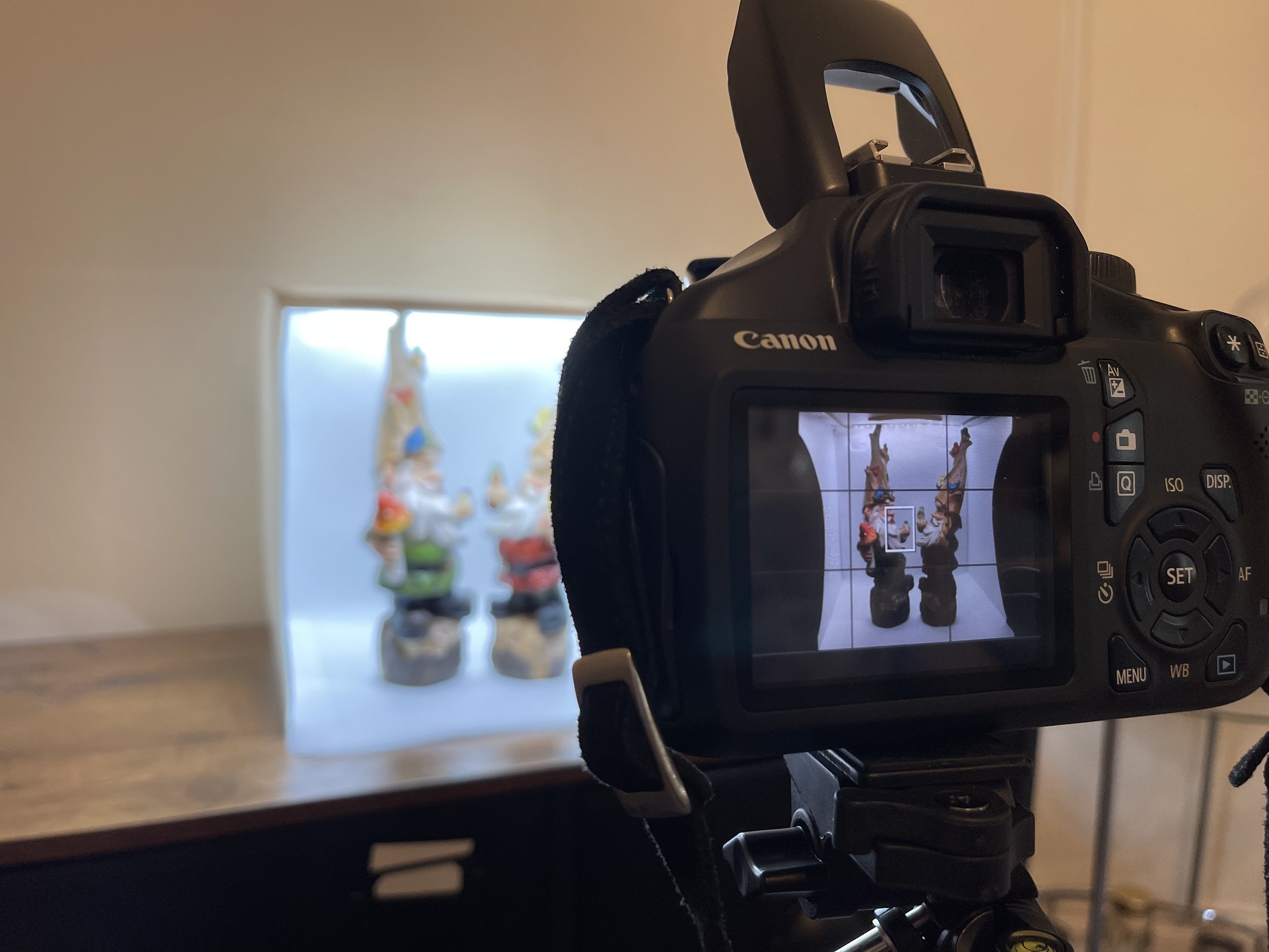
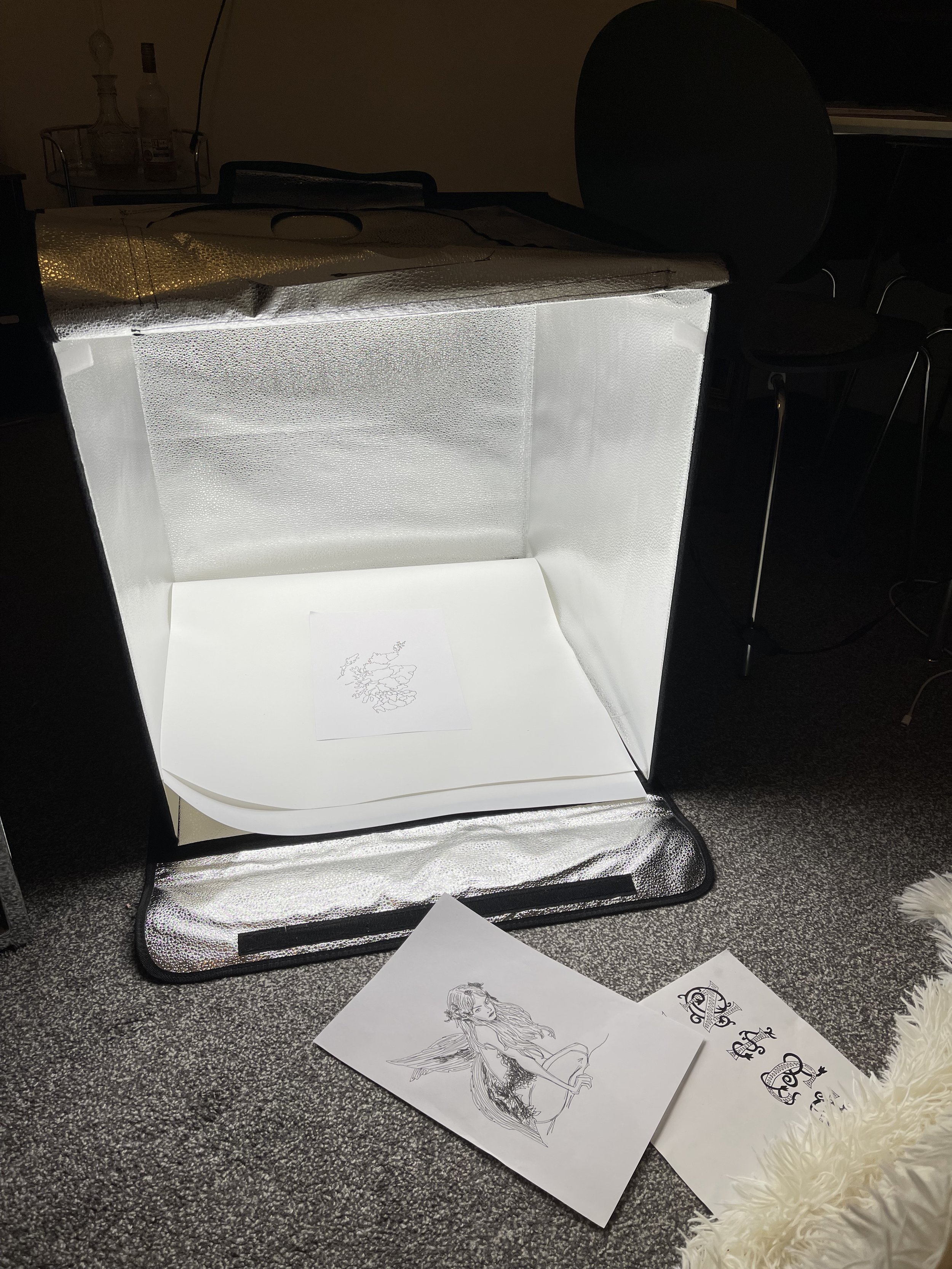
I purchased two lightboxes to photograph all my ‘found objects’ the first one is small, only about 12inches by 12inches and the second one is twice the volume. As every graphic designer knows, photographing your work is key because we are only judged by the digital hand in. In semester one I simply used my iPhone for photographing my work. In semester two I brought back to Scotland my old DSLR camera that I used in undergraduate school. However, this semester I wanted to go above and beyond, and I felt that the photographs that my old camera were taking were just not cutting it. I replaced my DSLR camera with a new version and together with this and the light boxes I was able to properly photograph all my work for my portfolio.

Week 10 - #1

This final process week I began to compile all the 3D pieces of my ethnographic art exhibit. I call them my “found objects”. I curated many pieces including figurines, arrowheads, decaying flowers and more. I created mini sculptures such as the fairy in a glass of milk, which is actually glue. I broke the pair of wings off a fairy figurine to show my viewer that fairies originally were thought to have no wings. I bought fresh flowers and let them decay over a week to photograph them as a visual symbol to relay how the fairies can be blamed for crops going bad. I chose each found object because I felt they described a piece of information that I wanted to share with the viewer of my exhibit. I plan to give out a brochure to explain each element of my exhibit and the historical mythical information behind it.

Week 9 - #5

If you have been following my blog since the beginning, you will have seen that I planned on making an etching and a print of one of my pieces of artwork. I spent multiple visits to the printmaking team and the supply shop as well as the laser cutting technician but, in the end, I was unsuccessful in making my digital sketch into a print. The technician I really needed was out of town on vacation and I just didn’t feel confident enough to complete it this way anymore. I found working in the studios a huge challenge this summer semester due to covid and technicians’ summer vacations. I was surprised that more people weren’t qualified to work some machines, I thought at the very least there would be two people per machine.

Week 8 - #5

At the end of week 8 I am pleased to announce that the manuscript piece of my ethnographic art exhibit is complete. I finished the digital designing of the text, the printing of the text using the risograph, the six illustrations and filling in each of those illustrations with my gauche tempura paint. At this point, all the paintings are very two dimensional and blocky. I would love to sit down and have another session in which I add in detail using the paint, but I will leave this to the very end of the semester, and only do it if I have time to spare. As a fine artist I know how to order my time so that I can always compromise on the finished project in case I do not have the time to finish it exactly to my liking. At this point I am confident in it enough to show it as a piece of my ethnographic art exhibit.

Week 8 - #4

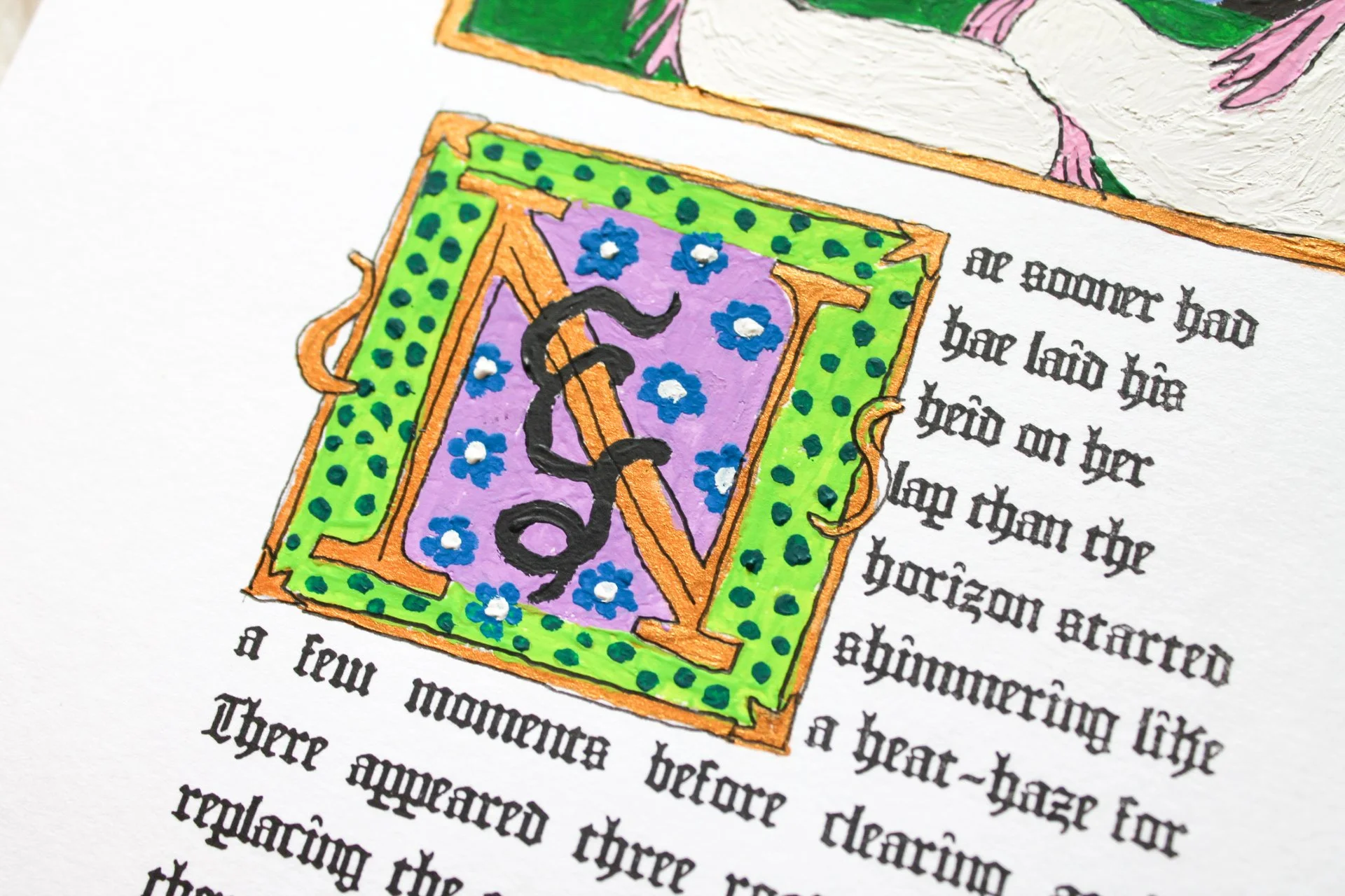
The final piece of my project I did this week was fill in the last page of my manuscript with paint. I used reoccurring colors to represent the same landscape as the rest of the story’s illustrations and made the title case letter in a similar but slightly different style as the first page. For the final title case letter, I wanted it to contrast the first with its colors. Since the first title case is at the start of the story, I chose a traditional color pallet of primary colors to seem boring in a sense. I wanted the beginning of the story to be cloaked in the reality of the real world. For the last title case letter, I wanted it to be bright pastel colors reminiscent of the fairy queen’s dress because at this point in the story the setting has gone completely into the mythical world of the fairies.

Week 8 - #3

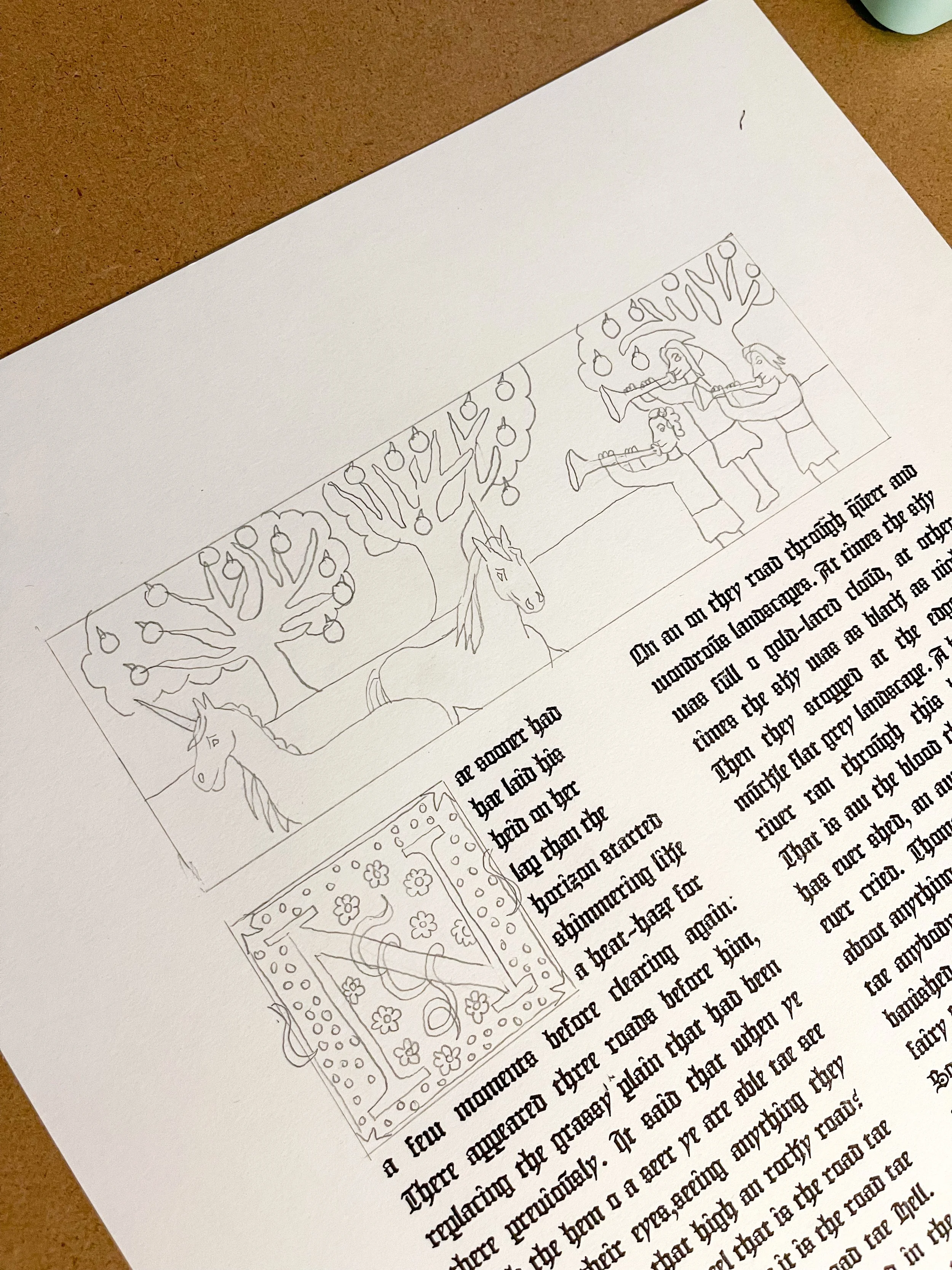
Finally, I started outlining the last two illustrations I have left to finish my manuscripts which happen to be on the third page that I will be displaying. It depicts the scene of when after the fairy queen and Thomas Rhymer kiss, she brings him back to fairyland and when they arrive Thomas sees unicorns grazing in the field below apple trees and they are surrounded with a thousand fairy trumpeters. As usual I used references of real manuscripts to illustrate horse figures and trumpeters. Lastly, I filled in the illustration for the title case letter that goes on this page. When it came to selecting which 4/8 manuscript pages I was going to illustrate, I wanted to pick the pages with all the scenes of the story and make sure to have at least two traditional title case letters to signal the beginning of a paragraph.

Week 8 - #2

Next, I worked on filling the second largest illustration of the four pages of manuscript. This is the final picture on the final page of the story. It shows how once Thomas Rhymer returns to civilization; the fairy queen vows to send him a sign to come home to fairyland to be with her. She sends this message in the form of two white dear, one stag and one doe. I put the fairy queen’s crown around the neck of the doe as a way to show the viewer the deer’s connection to the story. As with all the paintings I used the same color paint for the sky and landscape to try to show a consistency. I used a ballpoint pen to illustrate some elements of the painting such as the eyes of the deer. I know outlines of objects is a frequent occurrence in historical manuscripts, so I attempted to replicate that.

Week 8 - #1

This week was all about continuing with making my manuscript pages. I started by painting in the illustration on page two where the main character, Thomas Rhymer kisses the fairy queen after meeting her for the first time in the woods. This is probably the illustration that is the least stylized toward a proper historical manuscript, but I felt that a close shot would better serve the audience. I feel that emotion often gets lost in the illustrations of manuscripts because the characters always are shown with their entire body in perspective. Having the characters stand right next to each other would probably not allow for the audience to see them as kissing. I needed to get this point across through visuals because the text of the manuscript is not really meant to be read. I wanted to tell the story visually above all else.

Week 7 - #5

The most time-consuming part of my process this week was filling in my illustration with paint. Below you can see the process. I used the finest paint brush tip that I could find and was able to add in all the detail I needed for the piece. I have always been very lousy at mixing my own paint colors to use so I was glad I was able to fill out the whole piece with existing paint colors from my Gauche painting set.

One of the adjustments I made between my last painted title case letter and this painting was the black outline I made. I previously tried to use a permanent marker with the finest point felt marker tip that Sharpie makes. This time, I used a fine ballpoint pen instead. I was lucky it showed up over paint and I was much happier with the final appearance. It was able to capture detailed lines better than the thick marker felt tip. I still have some work to do on the details of this piece but I wanted to show the progress I made this week.

Week 7 - #4

This is the third and final illustration I worked on this week. It depicts the final scene of the story in which the fairy queen sends two white deer to retrieve her love, Thomas Rhymer, back from the village. She requested that he return to the fairy land following a sign from her and this was it. For this drawing, I found it impossible to find a reference from a medieval illuminated manuscripts, so I simply used a reference of an image of two deer found on the internet. All of these sketches are done by free-hand, and I was happy I was able to do this because I have gone a long time without drawing by hand and I was glad I still had the skill.

Week 7 - #3

For my next illustration I wanted to depict the kiss between the protagonist of the story and the fairy queen. I didn’t use a reference this time but instead used my first drawing as a reference for what the characters looked like. I am glad that I have a strong background in drawing growing up from an early age through all my schooling because I was able to draw all these illustrations in a few minutes and was happy with them. This is the part of the process that can be fast because the next part, filling in the color with Gauche paint is very tedious and slow.  With all my illustrations I measure out the edges so that they perfectly align with the columns of printed text found on the page.

Week 7 - #2

This week I set to the task of developing the illustrations of my manuscript. After filling in the title case letter of the first page I set out to fill in the biggest illustration of the project. I picked a scene from the story found in the text of this page and illustrated it by hand using a pencil. The way I did this was by finding references online of drawings of “lute players” or “woman on horseback” found in illuminated manuscripts. I stylized the background of the drawing and simplified it dramatically from anything resembling realism because art in the early Middle Ages was depicted in the same way.

Week 7 - #1

This week I went to class on Monday and had feedback on my project from a professor. I asked what size our degree show panels would be and was shocked to find out how limited the space was. I held up my eight manuscript pages to the panel during class and I knew instantly that I was going to have to make compromises on the dimensions of each project. Luckily, the manuscript was the only piece of the exhibit that was solidified in its dimensions. With the professor’s input I decided that I would choose only half of the manuscript pages to display. I felt like this was okay because I wanted the manuscript pages to be purely visual and not really meant to be read word for word, so I didn’t mind curating which pages to use and feel bad about leaving others out.

I also felt that this was an okay decision because I knew I was going to print a small, modern, easy to read publication of the same Thomas Rhymer and the Fairy Queen story that is meant to be read in order to contextualize the entire exhibit.

Week 6 - #4

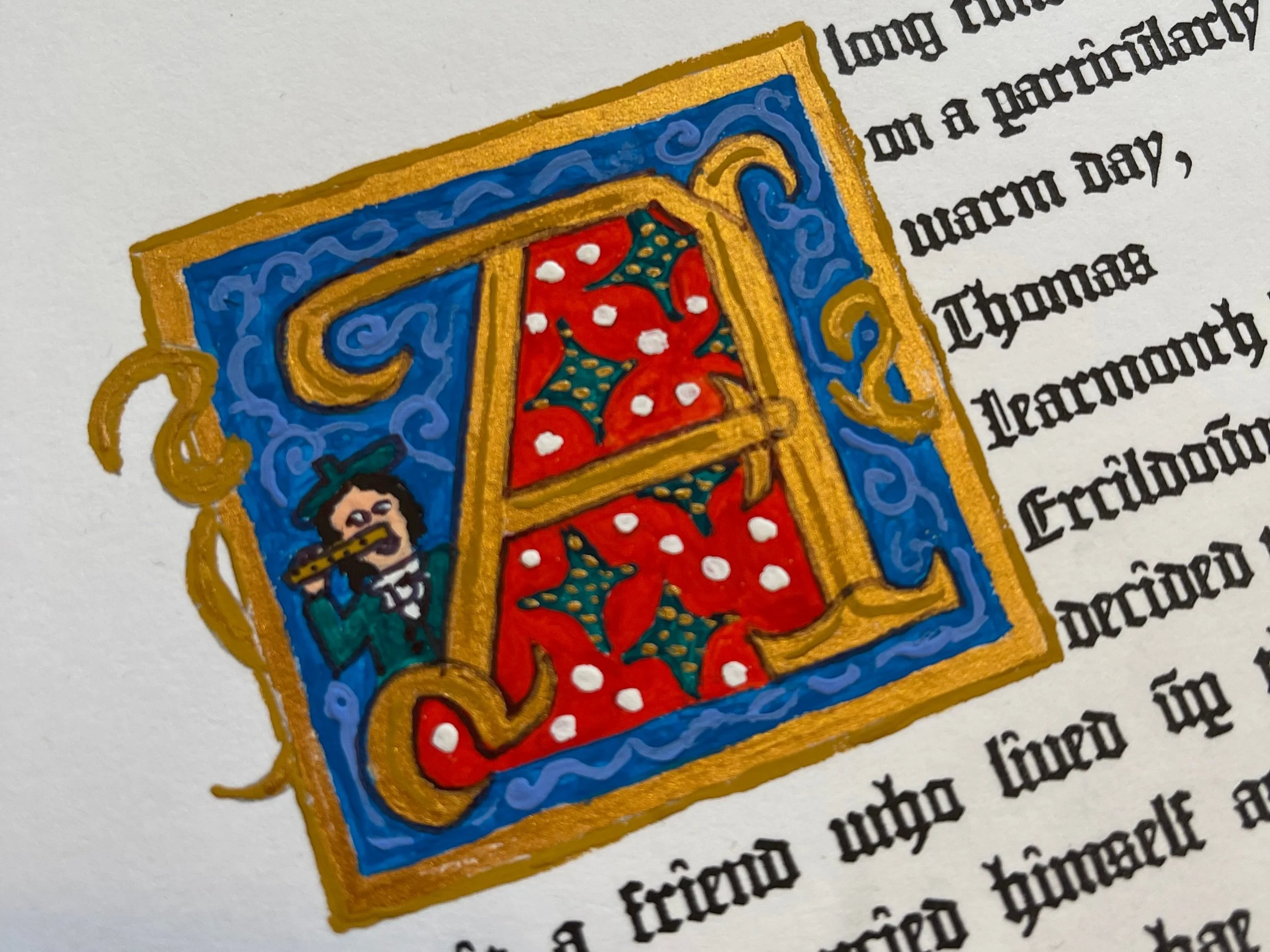
The last process I began this week was filling in some of the illustrations for my manuscript. I began by sketching a title case letter in the fashion of an illuminated manuscript. I then researched the type of paint that modern day manuscript makers use and found out it is called Gouache Tempera paint. After ordering a supply of it I began to paint in the color of the sketching. I used illuminated gold for the letter and colors for the surrounding area. I added in a small figure of my story’s character on the left-hand side. Once I finished painting all of the colors I went over a very small number of lines with a fine permanent marker. I’m not too happy with some of the details of the permanent marker so I might consider using something else next time, but I am happy with this result for today.

Week 6 - #3

This week I did get a chance to go speak with the printmaking technician about this as a sort of informal induction. There were a couple different methods of making a digital etching we talked about specifically the difference between making a linear laser cut or a pinpoint pattern digital cut. These are the only two options when creating a piece of metal to hold ink. There is also a second process of treating each metal with a chemical that will let the wells hold ink that was discussed but I will need further instruction on that to choose which to use.

Since my fairy drawing is digital, one of the things the technician and I spoke about was which photoshop effects to use to make the drawing compatible with both the laser printer and the ink. The two choices she gave me were “Indexing” the photo to reduce every line to either pure black or pure white. Below is the result.

I did not like the amount of detail lost in the image, particularly on the fairy figure and the sky. So I tried the next idea the technician had which was to bitmap the image. Below is the result.

As you can see, the entire integrity of the drawing stayed intact, and I was happy with this. Only when you zoom in really close can you tell that the image is a bitmap.

I wanted to try one more process of photoshop effect that I came up with on my own in order for it to be as close to a traditional engraving as possible. I searched youtube and found a tutorial on how to make your image with a pattern overlay so that it looks like it was etched, taking on the appearance of the images on American dollar bills. Below is the result.

Again, I was not entirely happy with this effect. I simply have too much white in my drawing and not enough solid color shading. After trial and error I decided to pursue using the bitmapped version.

While working with the printmaking team, I was instructed to go speak to the laser cutting technician in the Hunter building to collaborate on the choice between linear and pinpoint patterns but unfortunately, all staff qualified to use the machine were absent all week. I have really struggled with getting into studios this semester due to the nature of it being summer while also being a time where technicians are getting COVID. It has taught me that I need at least two visits to the studio to get a result so I will keep that in mind for the final deadline.

Week 6 - #2

Finally, my iPad drawing of the fairy queen in the fairy glen is finished! Only 30 hours later! This week was tedious as I had the task of filling in the patterns of the foreground bushes and grass/dirt ground. I ended up not using my photo reference very much for this task as the photo only offered solid colors and I know for an etching I need to use patterns. I decided to add pure black shadows to the bushes/flowers in the foreground because I felt I had to include a few more instances of pure black to match the door to the fairy burial mound and the celtic cross design. I felt this gave the composition its final touches.

I am very pleased with the end result of this drawing, I am proud of myself for making it more stylized than the original photograph reference because my whole artistic career I have been hyper focused on making things photorealistic. I just knew that that technique wouldn’t serve for this project, and I had to learn from the historical examples of etchings using line drawings.

Week 6 - #1

This week was my second attempt to book a Risograph appointment in the printmaking studio and I was successful! I was able to print all eight pages of my manuscript. I printed them all on A3 pages and made about 10 copies of each page. Since I will be adding my own illustrations and paintings by hand I thought it would be useful to have that many copies in case I make mistakes.

I used 220 Cartridge paper for my manuscript which is the thickest and nicest quality the Edinburgh Student Art Shop has and the thickest size the printer accepts. I wanted to get the closest version of the authentic manuscript scrolls that used thick parchment paper.

One of the hard decisions I made was where to use auto-aligned text with or without hyphenates. I wanted to stay true to the authentic historical manuscripts in that they had straight columns of text, but I wanted to avoid using hyphenates as the story written in Scots dialect in the gothic font is already difficult to read. I’m not entirely happy with the rivers flowing through the text but as an artistic choice I prefer it to hyphenates.

Week 5 - #4

My last blog post of the week concerns the progress of my etching. Here is the most recent version. I’ve now sunk maybe 20+ hours into the drawing. Since I last updated my blog about this piece I have filled in the sky, the mountains, the grass in the middle ground and the flowers in the foreground. What I was really surprised about is how much liberty I took in morphing the photo into symbolic fillings instead of solid colors. This reminds me of my undergrad printmaking feedback in which a professor told me I needed to use more patterns to create shading.

One of the things I also did was triple most of the layers so that they would be darker strokes. I am very lucky that adobe fresco can do this so seamlessly whereas a real drawing would take hours to do that.

One piece of feedback I got from a friend was that they didn’t really like the sky pattern. They wondered if there was a Celtic symbolic pattern that could represent the sky instead. I am playing with the idea of redoing the sky however I need to prioritize finishing the foreground in case I run out of time.

Next week I will be in the print shop using the laser cutter to print some samples on some aluminum and copper plates I bought. I would have done so this week, but the entire technician team was out of town, and I was unable to use the machine. I also had a scheduled appointment to print my manuscript pages this week, but the entire student art supply shop was closed for the day inexplicably and I was unable to buy paper to print during my appointment. This was a good lesson that the studio is a fickle place, and I will need to get ahead on making all my pieces incase more issues arise. I intend to make both of these items in the following process week.

Week 5 - #3

I have finished laying out my manuscript and I am preparing it to print. I decided to use the Risiograph printer again since I am familiar with the machine and since it can create multiple copies at a quick pace. I need to print out multiple copies of each page since I will be drawing my illustrations directly on to the page and will need backups in case I mess up. The printmaking team recommended I try to use the Reprographic department since I will only be printing in black but after reviewing the options of their paper quality, I was unsatisfied and decided to stick with the Risiograph.
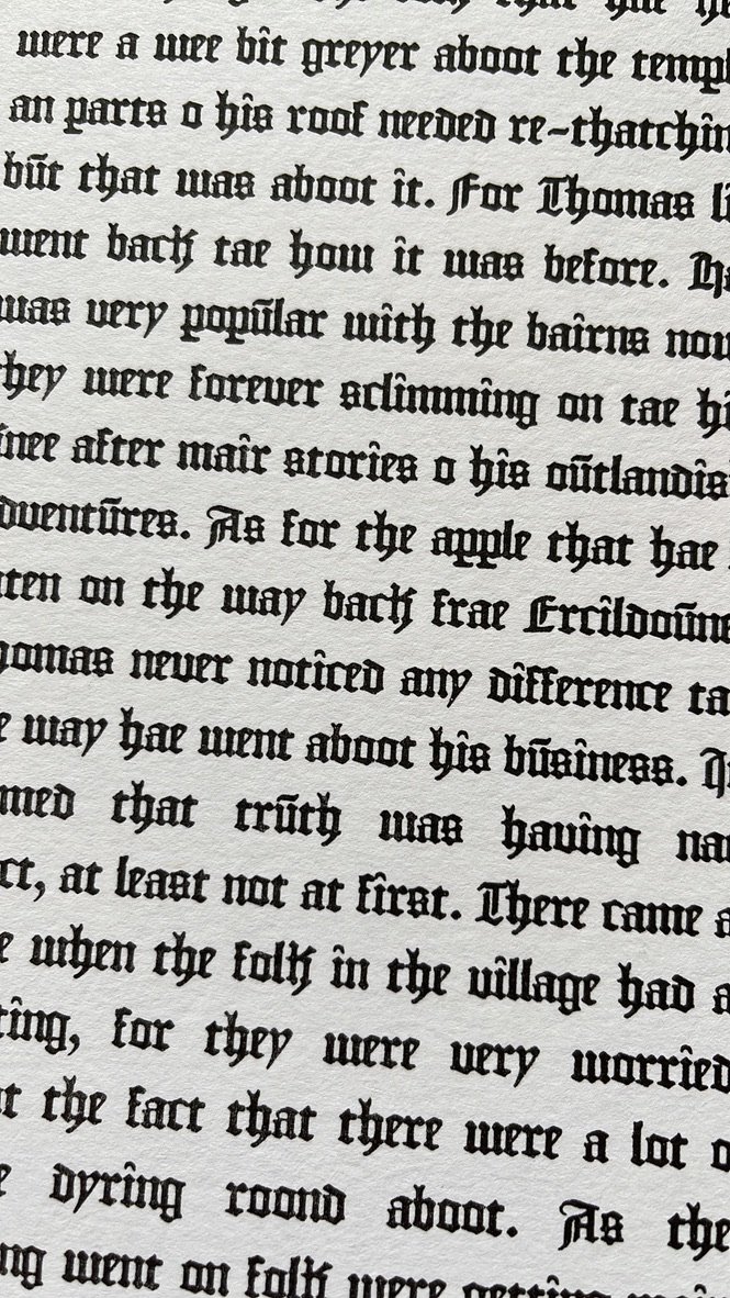
Below you can see the print ready version of my manuscript which leaves room for all my illustrations and illuminated letters. This process is mimicking the traditional way I’ve seen modern artist replicated illuminated manuscripts. They print the body text and fill in the rest. I believe this is also heavily inspired by the authentic way monks illuminated manuscripts in the medieval times too.