Week 5 - #2

Above I have shown the progress I made with digitally making my custom manuscript font. If you had told me at the beginning of the program that I would get close to making my own font I would be shocked and so I am proud with how far I have gotten.

However, upon further research into illuminated manuscripts I found a pre-existing font that has become the norm for modern designers and artists to use when making recreations of medieval manuscripts, the “1454 Gutenberg Bibel” font.

Ultimately, I decided to use this font to be authentic and because it offered a sense of uniformity of the text that my hand-written font was lacking. Below is an example of the font.

Once I had the font picked out I played with the alignment for a while. I wanted neat edges as all manuscripts do but I wanted to avoid using hyphenates because I felt it chopped up the story too much. I also made sure the text surrounding the title case letters weren’t too spaced out so I made them left aligned.

Week 5 - #1

This week I started playing around with the layout of the manuscript I’m going to make for one of the elements of my ethnographic art instillation. I typeset and pasted in the story of Thomas Rhymer and the fairy queen and started playing with the layout. After formatting the text, I planned out what I’m going to illustrate in all of the areas that are now black boxes. I arranged the lettering in a way that previewed what I’m going to do but I will also be drawing in the illustrated letters for the head of each paragraph.

At this point I used a Celtic manuscript font for the body text just for layout purposes, but I am looking into designing my own font.

Originally, I was going to make this a covered book but since there are so few pages, I decided instead to hang the pages on the wall inside frames on the wall of my exhibition. I believe this will be better for viewing and also it will be easier for multiple viewings at a time whereas a book would only service one person flipping through it.

Week Four - #5

After some excellent feedback from my professor, I decided that I would research ethnographic art and implement the technique into my final. My professor mentioned a strength of mine is how I contextualize the history of my topic and ethnographic art is a perfect representation of that. I looked at the Tate ethnographic art exhibit online and got a basic concept of what I could do.

I went through all the text of my semester two portfolio and pulled the most important facts about fairies. Using those facts II made a rough mockup of an ethnographic art installation using my past visual ideas, an existing painting and found objects.

I particularly liked this idea because I wouldn’t have to throw out all my old visuals. I could represent different variations of the fairy queen including a portrait, an etching, a manuscript, a booklet and found objects and let my viewer jump around and get a full picture.

Week Four - #4

One challenge I ran into was that I found two versions of the Thomas Rhymer fairy tale. Basically, no matter how old the myth, there is still a modern writer who brings it to the page in their own manner. The first version I typeset from my book is written in a thick Scottish dialect. It is a very poetic telling of the story but not that visually descriptive.

The second story I found was written in perfect colloquial English and is very, very descriptive when it comes to visuals. It doesn’t read like a true story more like a list of facts, but I was conflicted because it is very legible compared to the first one and paints an amazing picture for the reader of the fairy queen.

I presented this conflict to a professor who told me to explore making both versions of the myth and making them in different visual styles to represent each authentically. I could represent the authentic Scots telling of the fairy tale using a few pages of manuscript and I could publish a simply designed booklet with the English version.

Week Four - #3

I started to explore ways to represent text in a piece of art and I was drawn to manuscripts. Thomas Rhymer, the main character in the fairy tale I’m representing was alleged to have lived in the 13th century, so I looked for 13th century manuscripts. I basically narrowed it down to two style of manuscript. The first two found below are illuminated manuscripts from the 13th century in Scotland and the third option is a book with an etching published using a printing press a few hundred years later.

I originally felt compelled to pick the etching one because I had been working on an etching all week but ultimately, I felt the illuminated manuscript with the colors and simplified figures is better suited to the fairy tale. At this point I decide to make a manuscript as my final project.

I got started digitally making my font and laid out my fairy tale in InDesign. I want to lay it all out in InDesign and then print a stencil of it and fill it all in by hand. This is derivative of the original procedure when making manuscripts in the past.

Week Four - #2

I have been finishing up my Scottish mythology books this semester after reading about half of six books about it last semester. Coincidentally, while reading this week I found the perfect fairy queen story. It was really hard to simply Google details about the fairy queen and I was glad I organically found a story because the personalities of the fairies really come through in the retelling. After finding this story I decided that I want to integrate this text into my art because of my project proposal where I pitched the idea of both a textual and visual representation of historical information.

The story I am talking about is known as “Thomas Rhymer” or “True Thomas”. It’s about a flute player who stumbles across the fairy queen in the woods. She proceeds to take him back to a fairy land within a mound and he plays music for her courtly society. He leaves fairy land after agreeing to come back at the fairy queen’s request one day and she gives him a magical apple that instills magical powers in him. He ultimately uses his powerful knowledge and powers to save the town he lives in just in time for his fairy queen to call him to return to fairy land. After that he was never seen again and lived happily with his queen.

Week Four - #1

This is where I’m at in my progress with making my digital etching sketch. It’s primarily what I worked on this week. It has been a lot of trial and error figuring out the details of shading in an etch because you need to shade with texture, not actual shading. As you can see, I tried to start to fill in the mountain on the left but I realized I wasn’t going to do any solid colors, so I began shading the mountain on the right with lines instead. The sky was a major challenge that I spent an entire day on. I haven’t finished it but getting my iPad “brush” strokes to look like clouds was a trial and error and ultimately required a bit of stylizing and a departure from the realism I’m used to.

Week Three - #7

At this point I was wondering how I was going to turn a photo into a digital sketch, there was so much detail and solid shades. I knew the stylized etches always had a special way of portraying solids using lines. So, I attempted to make my image into a “sketch” using photoshop filters. The result wasn’t exactly what I had in mind, but I figured I could use it as an informative layer to hide and show while making my sketch. All I knew for sure was that I didn’t want my end result to look exactly like this photoshop “sketch”.

Week Three - #6

One thing to note in my diary that might seem redundant but was essential to my next steps was that I had to research the etching printmaking process before creating a digital sketch because I was unsure whether the ink sticks to the relief or the counter-relief of the metal sheet. I spent ages googling metal etches and I couldn’t find the answer. I was inverting my image and was looking at it really at a loss how I was going to sketch the inverted portrait.

Luckily, I found a great YouTube video where I watched the entire process of an etched print and finally felt confident that I knew the answer. Going forward I would not have to work with an inverted piece but in fact the sketched concave lines are the wells that hold the ink.

Week Three - #5

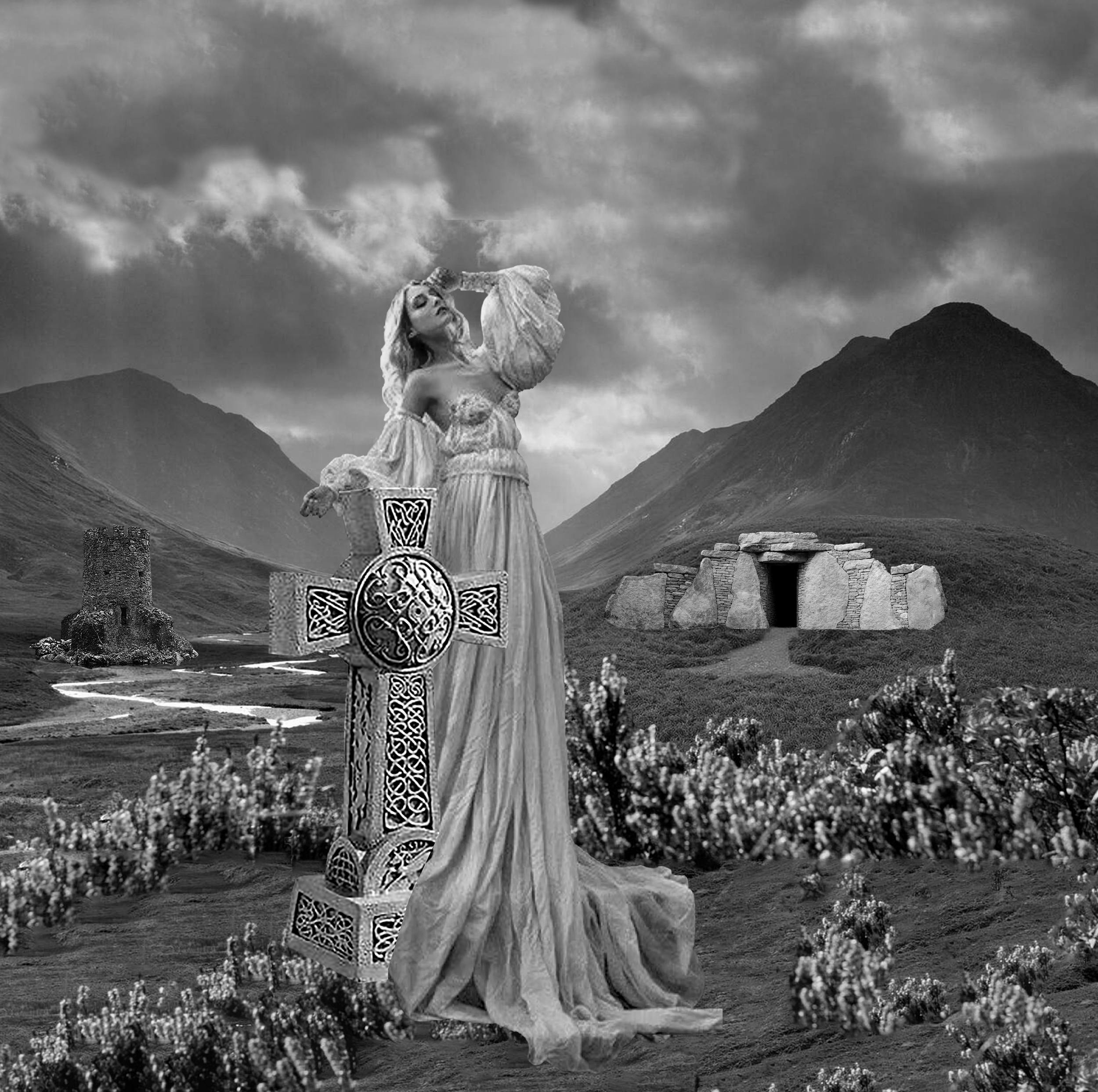
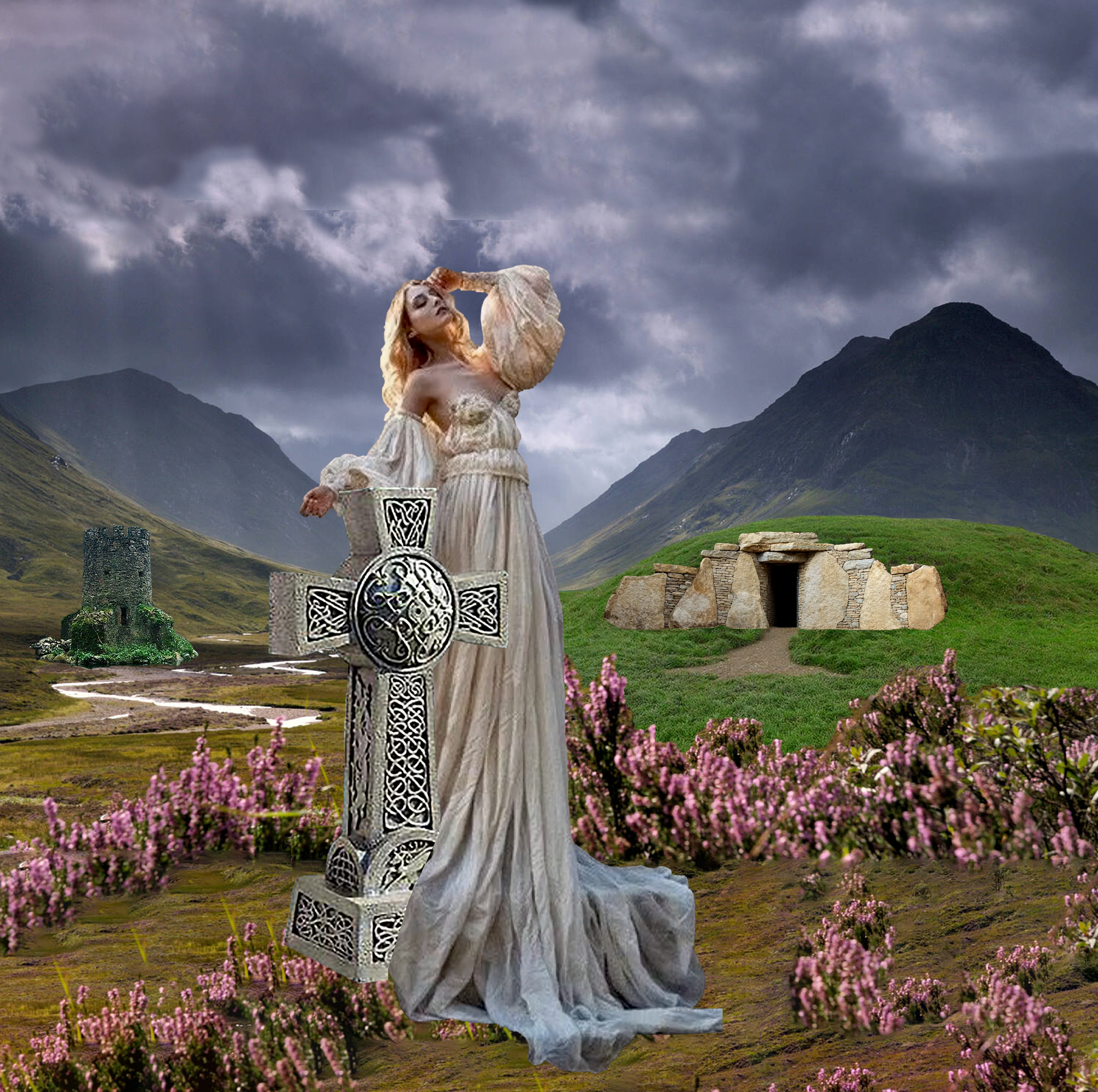
I was still determined to get an iteration of this concept finalized so that I could start the intense process of learning digital sketching on my iPad. I know that if my digital sketching isn’t up to par with the clear image I have in my head, my entire concept will fall apart. I settled on this image. I included a Celtic cross statue to further my iconography of Scottish visual cultural symbols. At this point I am happy with this composition however I am making sure I am keeping an open mind on potentially adding some fairy courtly figures to the foreground pending feedback and future development. At this point I know the image isn’t 100% telling the viewer the story that this is a portrait of the queen of fairies. It might make sense with an informational section near the piece but my entire project proposal was based around the idea of visualizing historical and mythical information in a contextual way so that the viewer can learn from it so I want to keep this in mind in my further iterations.

Week Three - #4

Next, I wanted to start visualizing the subjects of my piece of artwork which will be some variation of the mythology of the queen of fairies. One of the most interesting parts of my research from last semester is that the original mythology of the fairy society is that it is a courtly society, and all the fairies are often holding court or banqueting or feasting. I first started to play with that idea. The Queen of fairies is often depicted as an unusually large woman, but fairies are usually depicted as small people who are about 3 feet tall. They are ordinary looking humans apart from their size, so this is what I started with. I searched for references of women with medieval dress to splice into this image and was not able to find as much as I hoped. I decided to opt out of portraying the fairy court for now because it seems I will have to visualize this from scratch, and I need to develop my drawing skills and creativity before I can come up with it.

Week Three - #3

At this point, I’ve firmly set my mind on making a digital etching and using the piece to make prints. Now I have to start exploring visuals. I have done that by gathering images and splicing them together, first in illustrator for convenience using the clipping mask tool, and then more seriously in photoshop once I’ve decided on each reference.

I chose a landscape picture of the mountains of Glencoe, Scotland to set the geographical location of my piece and I added an abandoned Celtic castle on the left. I then searched for a burial mound because fairies are said to have lived in them. I cropped out the metal doorframe of the original mound and found a better-looking stone entrance to the mound to make it believable that a mythical creature made it. I added a cloudy sky to give the appearance of Scottish weather and I multiplied the flowers in the foreground.

Week Three - #2

Next, I started thinking about printmaking because I have studied it in the past and I love the process behind it. Sticking to the theme of making this piece look like it’s from hundreds of years ago and considering the mythical subject matter, I really couldn’t shake the urge to make this piece using the etching process. I have always been drawn to etches in history books because they utilize both a drawing element and a more formal printed element. I love the historical tradition of running a sheet of inked up metal through a printing press and creating multiple copies of my art. I am also drawn to producing an etched piece because it is a new process to me, and I wonder if I will ever have the materials, studios, and machines to do it again.

My first concern that I started to investigate during process week was that I might not have the time and skill to make an etching design by hand this semester. I studied digital printmaking in the past and knew about laser printers that could print on acrylic vinyl and become a template for a print. I wondered if I could repeat this process of digitally creating my sketch and laser print it on to metal.

First, I called the printmaking studio to make sure I could potentially run a sheet of metal through their press. The technician said that would work and that I would technically be the first student to try that. Next, I visited the Hunter building and spoke to the technician of all the laser cutters to see if there was a laser cutter capable of digitally etching metal. Fortunately, the school has just recently acquired a printer with that exact capability. I was very excited, and we went over all of the details agreeing that I would come back and run some tests on sample pieces of metal while I wait for an available intaglio printmaking induction.

Week Three - #1

Process week, for me, began with looking into mediums for my prospective piece of artwork. I wanted to get an idea of what I was going to use to then inform my decisions about how to design and execute the piece. By this point I had considered charcoal because that has been my medium of choice in the past and I am confident I can use it to get a photorealistic subject made. However, I soon realized that a photorealistic charcoal drawing is a very modern look and feel. Upon further thought I started to explore mediums that were more prevalent in history to encapsulate the essence of my historical piece of art. I want it to look dated, not “out of style” but with an aesthetic propelling the viewer back hundreds of years.

I began to think about oil painting considering at this point I want to make a portrait. I know there were a lot of methods in the past with the science of using oil in paintings. I also considered this medium because in my last iteration, color was essential to the piece. I would have a more descriptive piece with colorful oil painting. My only concern is that painting has always been one of my lesser skills especially with oil paint and I feared I won’t be able to master it in time for the execution of my final piece. My main goal is not to compromise the technical achievement of the piece in any way. I want it to be an excellent traditionally technical piece of craft.

Week Two - #6

My last post was about a reference I made of the fairy queen including a more traditional portrait of a medieval queen. I decided to replicate this image on a A2 sheet by hand. At this point in my project, I am exploring using color in my piece of artwork. I was never very good at painting with color as charcoal portraits were my strong suit, but I want to challenge myself for this project. I made a mockup of this portrait with color pencils. It had been ages since I have used color pencils for a piece of artwork, and I felt that the quality didn’t come out as I hoped for. However, I am happy with the scale of the piece of work, and I am happy with her stoic stance and facial expression. I did not have time to finish this iteration as the whole item took me six hours to complete just this version.

Week Two - #4

My project proposal was all about visualizing history in a way that was both visually rich and informationally accurate. I wanted to find a balance between literature and images. I did this because I often feel like images without text as well as all text-based history is hard to contextualize. So for this project I want to make a portrait of a fairy while also adding text to explain the specifics of her story. I wanted to include this text as part of the art instead of just including it on an informational plaque in a museum because I feel that those plaques do a disservice and people often focus on them too much and avoid looking at the image. I also wanted to do this because I hate when I find it hard to understand a piece of art’s purpose.

I created this type face of both lowercase and title case letters based on medieval manuscripts I have been reviewing over the last semester. At this point I am envisioning putting these letters on my portrait in gold leaf.

Week Two - #3

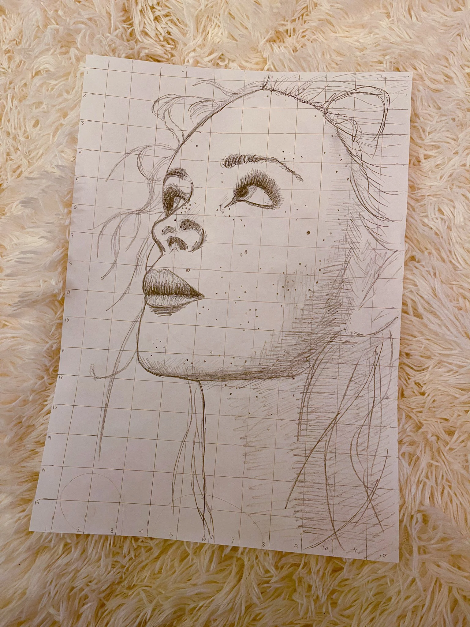
For my next iteration I wanted to test my old skills at the type of portraiture I used to specialize in during undergrad. I wanted to hone in and focus on the face of the fairy queen and what I believed it would look like. I drew this portrait with an engaging position of the face with long hair and lots of fly-away hairs and lastly, I added freckles to emphasize her connection to the British Isles heritage. At this point in my process I am imagining using charcoal on paper as a medium and making the piece black and white.

Week Two - #2

This is the first iteration I made of a portrait of the fairy queen. I wanted to try a landscape background of the Fairy Glen on the Isle of Skye in Scotland. I took all my references and pieced them together. I depicted her with a crown, with a wand and with a ball of yarn which is often the visualization of the fairy queen’s power to unravel spells all over Scotland. I drew a portrait based on my references out of pencil. I then showed my drawing to a friend who said that the sitting version of this portrait wasn’t portraying the fairy queen’s power so I designed a second version where she is standing with a conquering pose.

Week Two - #1

Brief Overview of Fairy Queen Research

Resolved that I would like to make a piece of fine art for my final outcome I set out to look for a subject in Scottish fairy mythology. I started by looking into Nicnevin, Queen of the Fairies, Queen of the Witches. She appears in folklore from the 1500s onwards and the truth of her nature is shrouded in mystery now and comes to us only in hints and obscure references. I felt that this would be a good idea to visualize because it would make a solid piece of work to add to the character’s obscure image. The meaning of Nicnevin’s name is unknown although it might have been derived from a Gaelic name meaning “daughter of the little saint”, “daughter of the little bones” or the Irish war goddess Nemhain.


"Then a ready company came, soon after close,
Nicnevin with her nymphs, in number enough
With charms from Caithness and the Canonry of Ross
Whose knowledge consists in casting a ball of yarn...

The King of Fairy, and his Court, with the Elf Queen,
with many elvish Incubi was riding that night.
"

-Alexander Montgomerie, 16th century poem


Nicnevin is described as being a giant and a grandmother witch/fairy. She is connected with storms and compared to the Goddess Hecate. She is visualized as riding at the head of witches, fairies, sorceresses and elves.

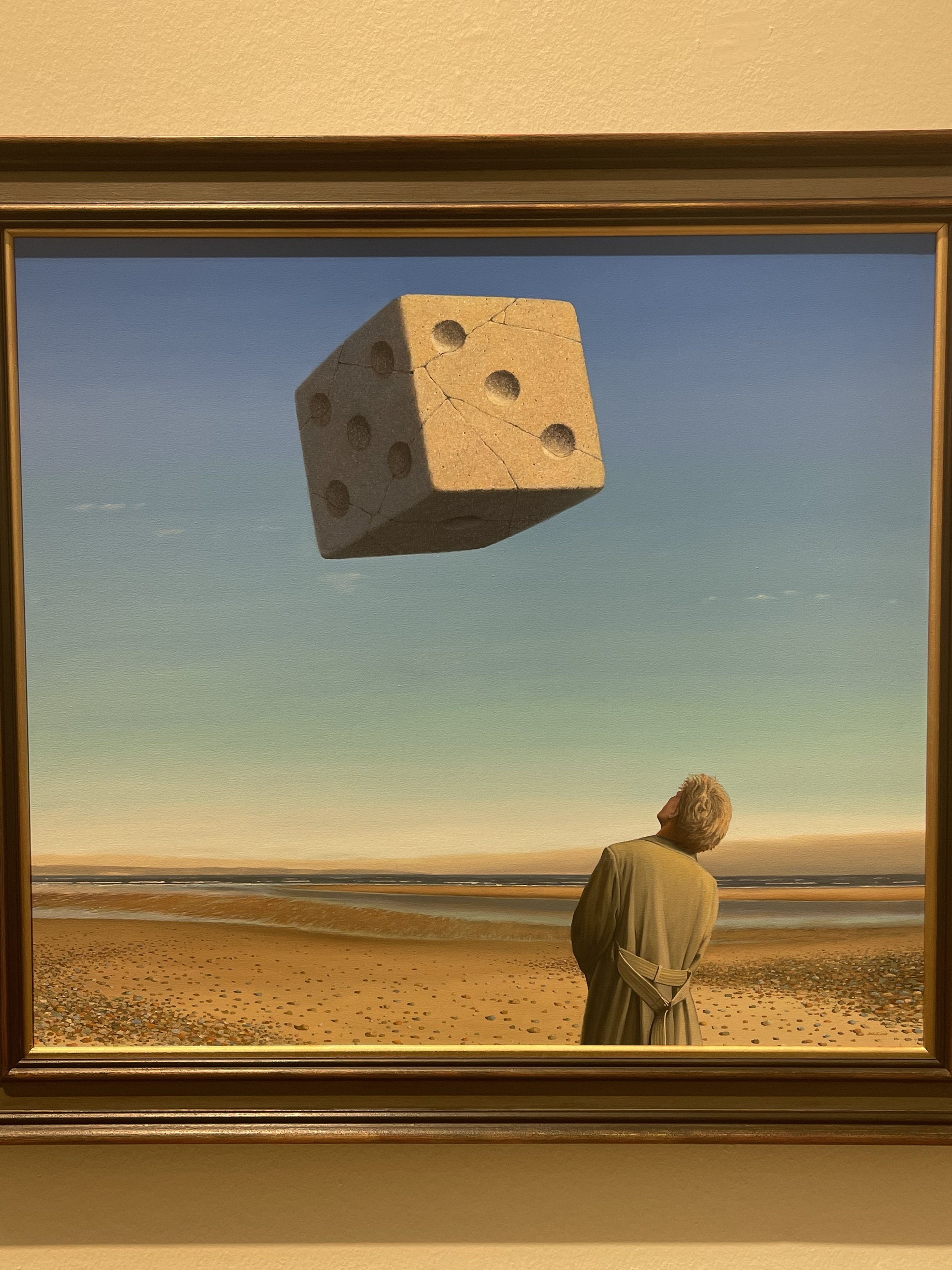
Week One - #4

Gordon Mitchell

Twenty One

Oil on canvas


This surrealist painting is the one piece of artwork that has really stuck with me since my visit. I have always loved surrealism but sometimes I feel the artists go overboard with their sense of wonder portraying too many subjects at once. This painting is unlike that in that it gives you one odd phenomenon to mull over it’s meaning. The realism technique of painting is well served and perfect for this piece. My interpretation of the meaning comes from the title of the piece, “Twenty One”. I am aware that this is the number of dots that all sides of the die add up to but I think in this piece it has to do with age. I feel that the gray-haired man is looking back at what it meant to be twenty-one on the verge of adulthood. I believe the dice is a good choice because it is indeed a tool for a childhood game, but this particular dice is made of stone and weathered and cracked. I imagine that looking back on your life can be a very surreal thing and something people don’t do very often.