#20

Welcome to the final product! Our art installation marketing the cause of wildfires caused by climate change. Here is video footage of our final installations. You need to see the full interactive result to be able to get the full effect. We hope that when people see this they can get the full effect of our wildfire research. We need to accelerate our process of getting rid of green house gasses if we want to stand a chance. I am glad we were able to display gas in the atmosphere with the projector that was one of the hardest parts and it was really important to me. I’m glad with the final result of this project and glad with my portion of what I contributed.

#19

Here is where we developed our final art installation. We used a projector to create a burning atmosphere effect and set the burned shapes up in an artistic way. The projector background actually moves and has a burning and crackling noise. The projector had a funny color reading display because initially the blue gradient we designed was white. But I have to stay I like the blue more. We then crushed ash on top of the installation and recorded videos. When we could, we added a smoke effect to the project. Overall it was a great experience and i believe anyone could interpret this art installation.

#18

Welcome to my favorite stage of the process! I volunteered to help do the burning I am always very excited to apply tools to my fine art projects especially when it involves adding heat. We had multiple strategies to the burning. We first started to just burn the edges but then we liked the effect we got after really torching the center of the piece. We liked when the wood started to bubble and scar.

At one point Yifan got a little carried away and we lit our entire family of shapes on fire. We couldn’t put it out in a controlled way so we had to let it burn into ash. It turned out to be a great video and also we saved the ash and used it as a decorative part of the final piece.

#17

After we got back from COP26 and we had a rethink about how to get our pieces to look better we decided to re-cut the same shapes using the laser printer but this time with wood as the base material. We went to the wood shop and looked at their free wood options and since they didn’t have anything for us we went and bought 4mm thick Birch ply wood to laser cut. The laser cutting worked well and we produced loads of pieces and back up pieces for use in our art instillation. On top of that the laser cutter already singed the edges which was the first step in our process of burning.

#16

This was also presented at COP26 it is our first attempt at an art instillation. Vic laser cut these shapes into some sort of synthetic material and painted them certain colors. He put them together to symbolize the intermixing of all of our elements of fire, ash, carbon, bone, charcoal. Following feedback with a professor we did agree that the shapes look a little too perfect and they do appear to look a bit plastic. We decided we definitely needed to find a way to incorporate both wood and authentic burning.

#15

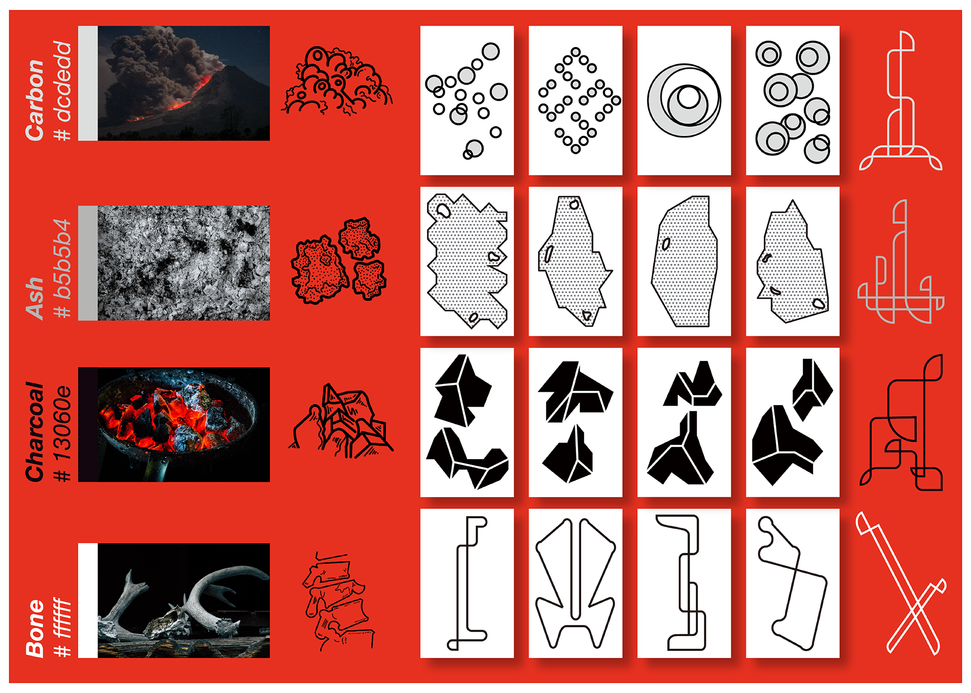
This is a slide from our presentation at COP26. As I mentioned before we focused on four elements to artistically visualize fire, carbon, ash, charcoal, and bone. One of our group members created four groups of visual symbols found in the white boxes below and on the very end the four elements of fire are found. We wanted to use these visual symbols as our art instillation. We have more than one idea about exactly what to do with them.

#14

This is all of the visual research we did that will contribute to our process of our art instillation. We know that ash is the most important part of our project. We wanted to play with the idea of it and the aesthetic of it. We also needed to incorporate burned wood and wood of some kind to make a parallel to the forest fires. We also needed to come up with a way to visualize fire and the result of fire. Lastly, I wanted to personally include some way of visualizing the atmosphere and the resulting gas in the air contributing majorly to the problem.

#13

I took the initiative on preparing all of the research for the design agency again for this brief and here is what I came up with. I did an in-depth look at the instance of the California wildfires in the last 10 years. I found that 50% of the wildfires are caused by the negative effects of climate change. That does mean that 50% of those wildfires are normal.

If there is a single cause of the problem it’s green house gas emissions. We need to halt our green house gas emissions ASAP in order to protect the environment from spiraling out of control when there is a spark. There is a vicious cycle of burning, too many green house gasses spark the environment, the fire creates drier environment with even more green house gasses and more fires get inspired by more fires.

A few of the solutions we have is

  1. Reduce green house gas emissions

  2. Invest in wind and solar power energy

  3. Invest in CO2 vacuums

  4. Firefighters and national park administrators need to carry out “prescribed burns” where the dead debris of old vegetation is cleared making the environment less of a tinder box.

  5. People need to stop building houses too deep into forest, too much human activity near the forest can cause vicious sparks.

  6. Tree felling companies and power companies need reform to stop using faulty machinery, a power and electric company in California went bankrupt for all of their fault in the California wildfires. This could have been avoided by simply more routine maintenance.

#12

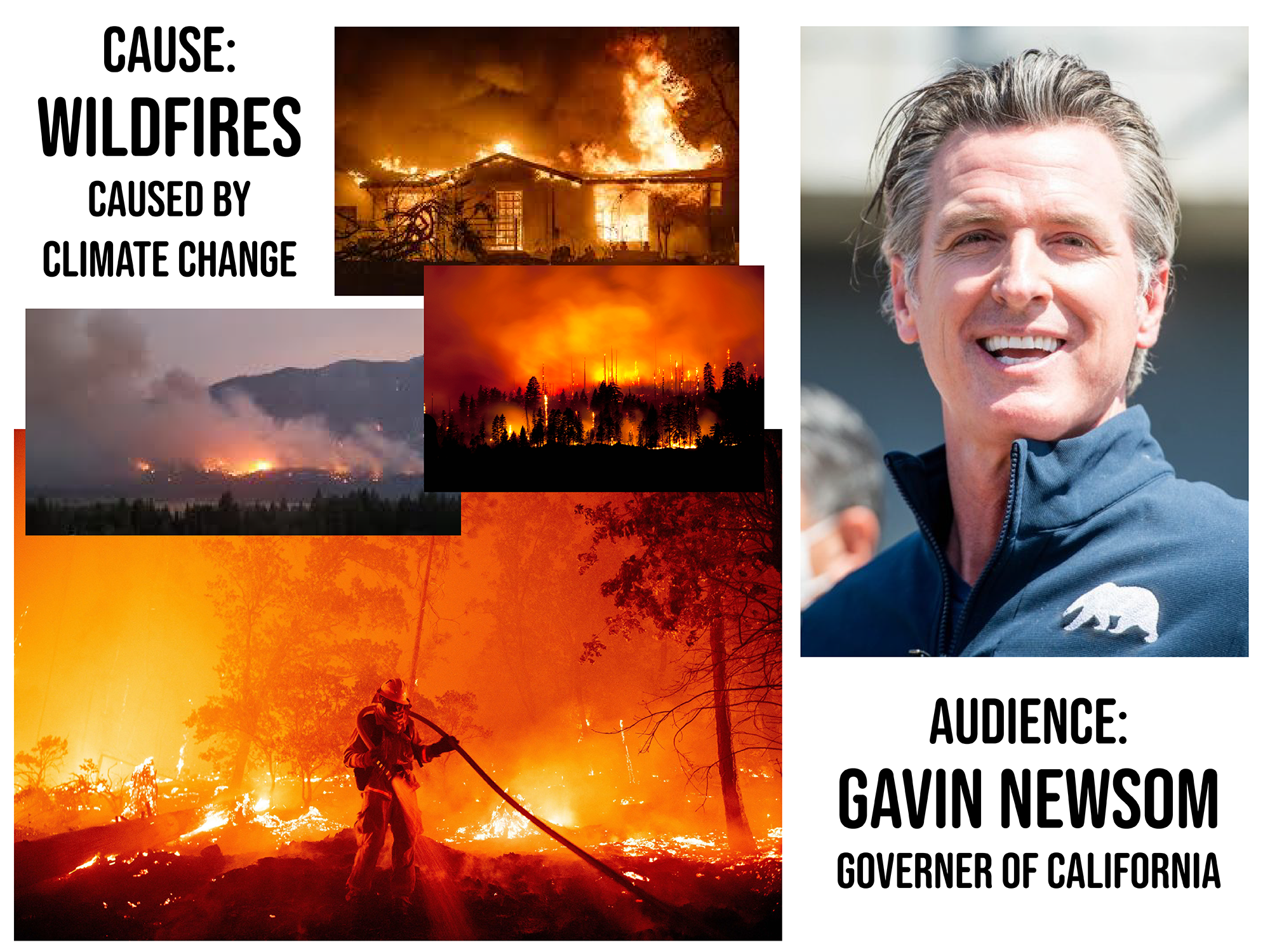
On to our COP26 brief! As a design agency we spoke about all types of issues the world faces. I always am so angry about plastic being in the ocean and wish there could be a solution for it. However we quickly realized every group around us was doing something related to the oceans so we decided to tackle a different issues. We spoke about the wildfires all over the world and the deforestation as a result of it. Not only deforestation but burning of habitats and homes and loss of human and animal life. We wanted to research exactly how climate change has negatively impacted these wildfires. Were they impacted at all? Were they 100% inspired by climate change? 50%? Is there anything we can do to stop it?

We decided to make Gavin Newsom our target audience. He is the governer of California, his state was hands down the most affected by the wildfires in recent years out of all the US States. He’s young, he’s liberal, he does tiktok, he’s got good style, he’s always looking to help change things we think he would be perfect.

#11

This is a branded poster we made for the Celtic culture. I provided all of the research and text and images and Vic arranged the graphics. I pointed out the most essential aspects of reviving Celtic culture. In this case the pictures that made the cut were tartan wearers and the famous painting by Scottish painter John Duncan whose paintings of Scottish characters were a massive part of the revival of Celtic visuals.

#10

One of our group members was a champion and designed this typeface for us. I have never made a typeface in my career before and I have never studied graphic design in my previous degree so I was happy for someone else to take this task over.

He went with a blackface Old English style font but what I like about it is that there is still a modern touch to it. The font symbolizes what we are trying to do as an agency – record history but redesign it in a way that it is more interactive, modern and engaging.

#9

I took the initiative to organize the Instagram page of our group as I designed primarily for instagram at my last three design jobs in the last three years of my career. The trick is not to overcomplicate the design. Instagram is a fun lighthearted medium where each piece of artwork gets a few seconds of a glance. I tried to encourage my group members to keep that in mind when it comes to how much time and effort they are putting into a single post. I also know from experience that at the rate that you need to make Instagrams, about one a day, it is important to spend about an hour or two only on the design.

In this piece I was inspired by Irish Celtic ornate jewelry commonly known as a Claddagh ring that depict a pair of hands holding a heart with a crown on top. I wanted to use that as my center point. I then researched a border that was characteristic of the Celts and incorporated the interlocking geometric shapes to make it. Lastly I wanted to add four leaf clovers, a common emblem of Ireland, but I wanted to stylize them in a way that also incorporates the Celtic style, with hard interwoven geometric lines.

#8

This is a mood board I made that is inspired by Celtic culture historical visual culture. I have combined many elements of my research along with elements of my visual research into one piece. What is most important is the ornate celtic style found in the jewelry and crosses and doors. That style should be preserved. I also included visuals of a Pictish woman in the bottom right which is an important part of “erased” Scottish history. The Picts were an ancient race of people who’s DNA lived on and was passed down but their culture was not. It is a sad story and one that I hope to avoid with the goals of our agency.

#7

My research did not fit in just one blog post so I have taken the liberty to extend it to here. A few other elements of Celtic culture that were vulnerable or are still vulnerable to being lost are the Irish visual language of Ogham and the religious practice of Druidism. Ogham has slowly died out however we do have the basic elements of how the language works and now would be a great time to record it professionally to preserve the language. Druidism is a bit more far gone as the Roman occupation killed most of the druids in the celtic lands of that time. Whatever information we have on them I highly encourage us to write down and preserve.

Lastly one of the things I really wanted to share with the group was that so many holidays in America and elsewhere are inspired by Celtic pagan holidays. I really want to spread that knowledge because it is easy to believe that all of our world is inspired by Christianity when in reality Christianity took much inspiration from ancient Celtic traditions such as Yule (Christmas) Samhainn (Halloween) Beltane (May Day) and much more.

#6

Bring on the research! This was my favorite part of the project as studying Celtic culture is a personal hobby of mine. i’ve been reading books on it for years every weekend while I had my design jobs. I love to design during the week and return to my historical books on the weekends, it always rejuvenates me and gets me ready for the week ahead.

In this instance I found that there was already a Celtic Revival in the last hundred years in Britain and Ireland and that the main goals of the revival were to

  1. Celebrate literature by authors from Ireland, Scotland, Wales etc.

  2. Inspire more people to learn Gaelic

  3. Preserving and recording the ornate art style

  4. And popularizing celtic folk-lore

I found some of the most famous writers of all time such as Scotland’s Sir Walter Scott, Ireland’s Thomas Moore and the National Bard of Scotland, Robert Burns.

Now since our design agency focuses on reviving visual culture that is almost lost, I focused on tartan as it was a material element vulnerable of being lost after the Scottish rebellion of 1745.

#5

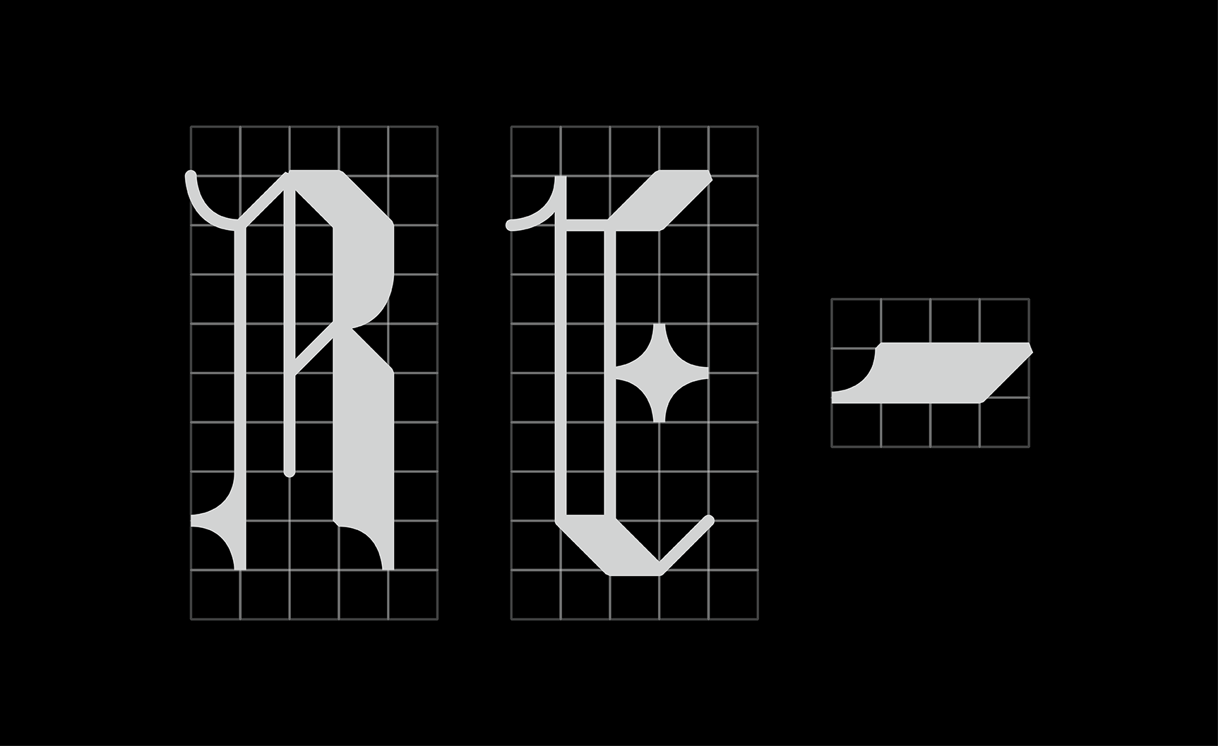
At last we finally get to the design of the logo we officially went with. A group member was kind enough to design an entire font family for our agency inspired by traditionally historic blackletter with a touch of modernization. This is the agency name in those letters. Our team member chose light grey instead of white and opted for our visual identity to use black as a backdrop as often as possible when displaying our typeface. The barely visible grid behind the letters adds for a special touch.

#4

We continued to brainstorm ideas for our logo, in fact, we spent an entire three hour session drawing sketches of ideas. We had just came up with the name of RE- inspired by the idea that we wanted our historical visual culture to be RE-BORN from our design work so we toyed with the idea of a phoenix logo as a phoenix rises from the ashes of destruction, reborn.

This is a loose mock up I made using a sketch we made in class of a Phoenix logo. We ended up not using this logo along with the other one I designed for the group. I was onboard with the decision not to use this logo. It seemed a little bit too simple and dated to me.

On the left is a sketch made by a group member in class and on the right is my vector version made using illustrator.

#3

Our naming process came relatively late during our concepting process. Someone in our group had brainstormed this idea at home and brought it to class to discuss with us. We decided we liked the idea of naming our agency “RE-”. We came up with all of these words that started with RE that corresponded to our manifesto. We wanted to REVIVE forgotten history, RENEW it, REPRESENT it, REFERENCE it, RECONSTRUCT it. From this RE- Design Agency was born.

#2

I designed this piece using vector work in illustrator. It was inspired by a celtic broach I had found in my research.

In the early days of our concepting for the logo of our design agency. We considered using three ‘sun’ motifs from the three visual cultures we wanted to focus on. I decided to focus on the Celtic visual culture of Britain and Ireland. This culture has always held a special place in my heart and is one of the main reasons I moved to Scotland in the first place.

For my contribution to the logo I designed the image found here. I did a lot of research into the designs of the Celts and found recurring patterns of interlocking geometric shapes often in ornate jewelry and on carved stones. I incorporated that here.

We ended up passing on using this design as a logo as we developed our manifesto more and found that our agency name warranted a logo as text only.

#1

This is an image of the world I designed using watercolor painting that I handmade on my ipad.

On our first day of our masters program we were assigned a group of six and asked to mind-map what we all had in common. We explored many possibilities but the one that stood out was that we all enjoyed historical visual culture of some kind. Some of us enjoyed the culture of our homes and some of us enjoyed the cultures of foreign lands.

Knowing that our goal of our agency project was to help the planet in some way we came up with the idea that as an agency we wanted to help preserve visual cultures that are at risk of being forgotten. We want to preserve and record visual material history using design as our medium and we want to design the historical information in a way that would make it more engaging and interactive. This manifesto was our creed and our underlying thought for the rest of the semester.