#17
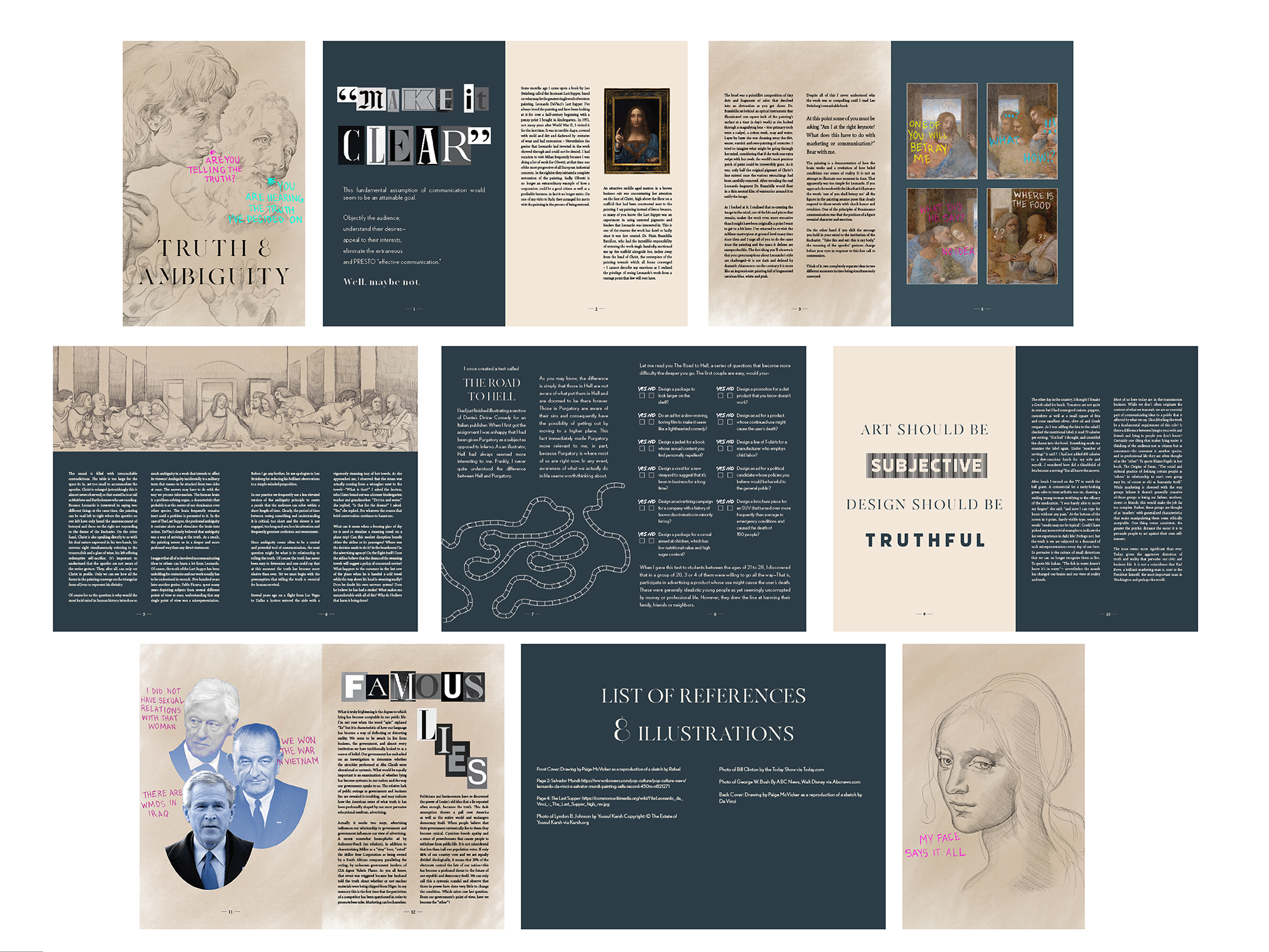
/On to my fourth iteration! This is very very close to my final version. I was searching for a bold color to match my beige and was happy I finally found this navy. I changed all of the white text on top of the navy to a beige colored off white. I included my last supper drawing on the third spread. I reworked my road to hell page because I received feedback that the ballot page inspired look felt disjointed from the rest. I got rid of all pure white backgrounds on the magazine to give it a more polished look. And lastly I changed the typography of the “ART SHOULD BE SUBJECTIVE DESIGN SHOULD BE TRUTHFUL” to two fonts that make SUBJECTIVE look more unclear and TRUTHFUL to look more clear. I let this quote with all of the negative space really anchor my entire essay.


